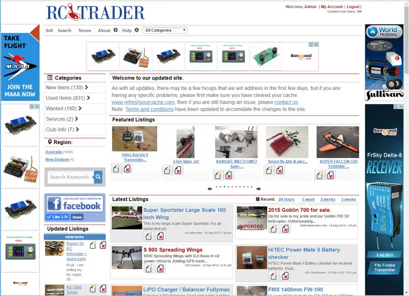
The RC Trader website is based on what is known as responsive design. In general, this means that the page will adjust differently from one screen size to another or one device type to another.
So, on a normal large screen, the front page of the site will look like this:
On a mobile device less than 800pixel wide it will convert to a mobile device menu system.
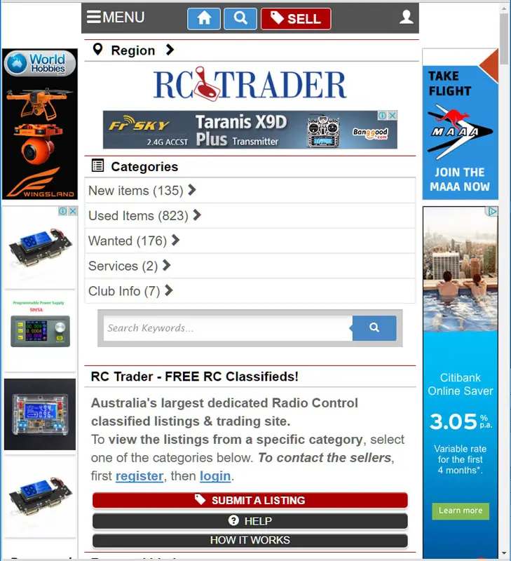
The main differences between the two are:
- The mobile navigation menus
- The one column format
The three lines on the left side of the menu will display the normal menu system:
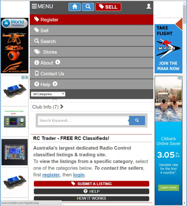
Clicking on the "head icon" on the right will present the user menu options:
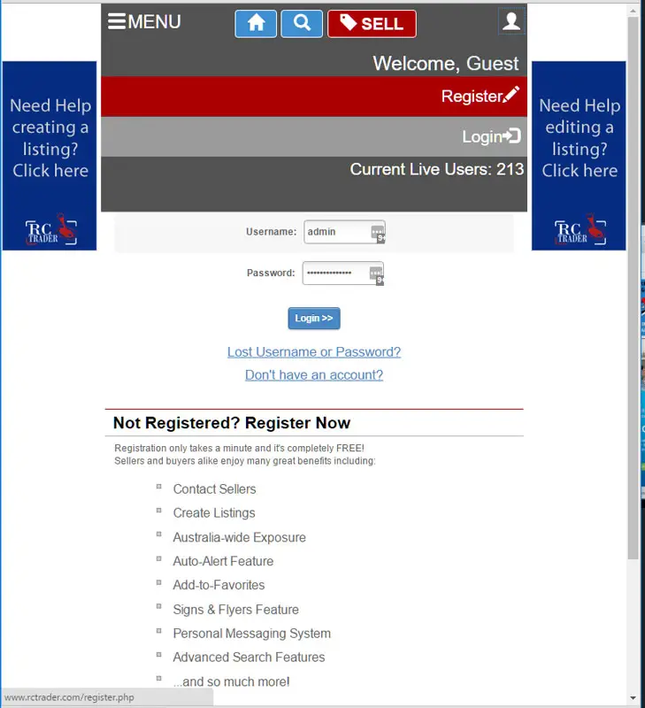
When logged in, the user menu provides you with access to all your user items:

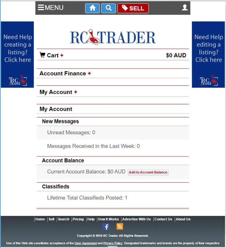
When in the "my account" area where you manage your account and listings, you also have areas that open up for ease of access:
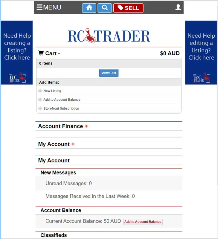
By clicking on the + sign to the right of the Cart heading gives you the cart options:
Clicking on the + sign on the right of the "my Account" headline gives you access to the My Account options, and so on.
